Eén
Radical rebrand for Eén (One), a progressive public service broadcaster with a clearly defined purpose to improve inclusivity and promote positive social change in Belgian society. We worked in close collaboration with the team at Eén to create a fresh, refined identity that matches the progressive ambitions and evolving content of the channel.

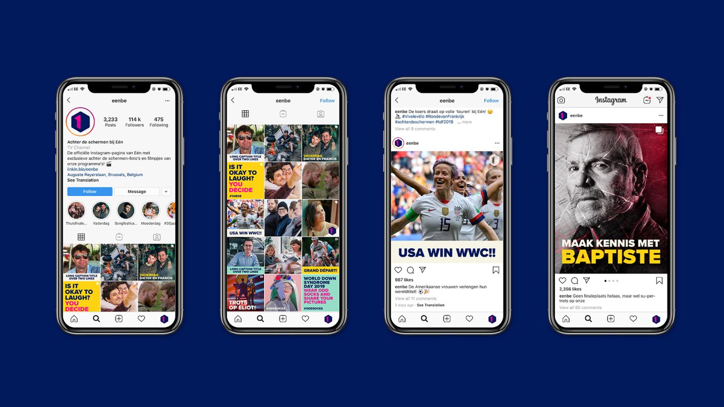
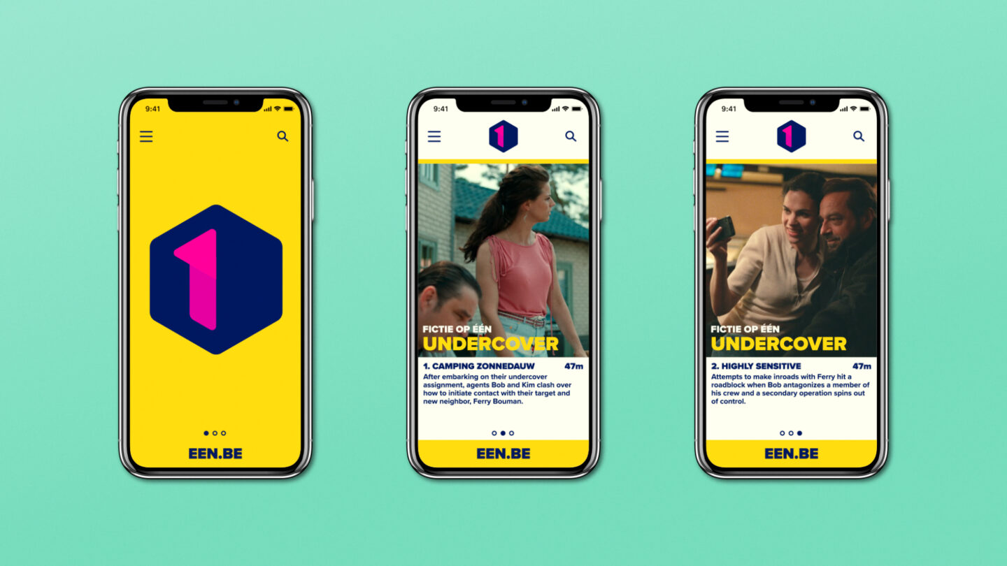
With the planned expansion of digital content and video on demand there was also the functional need for a digital, motion-first identity, purposefully designed to translate seamlessly from linear broadcast into social media and digital spaces.
Logo
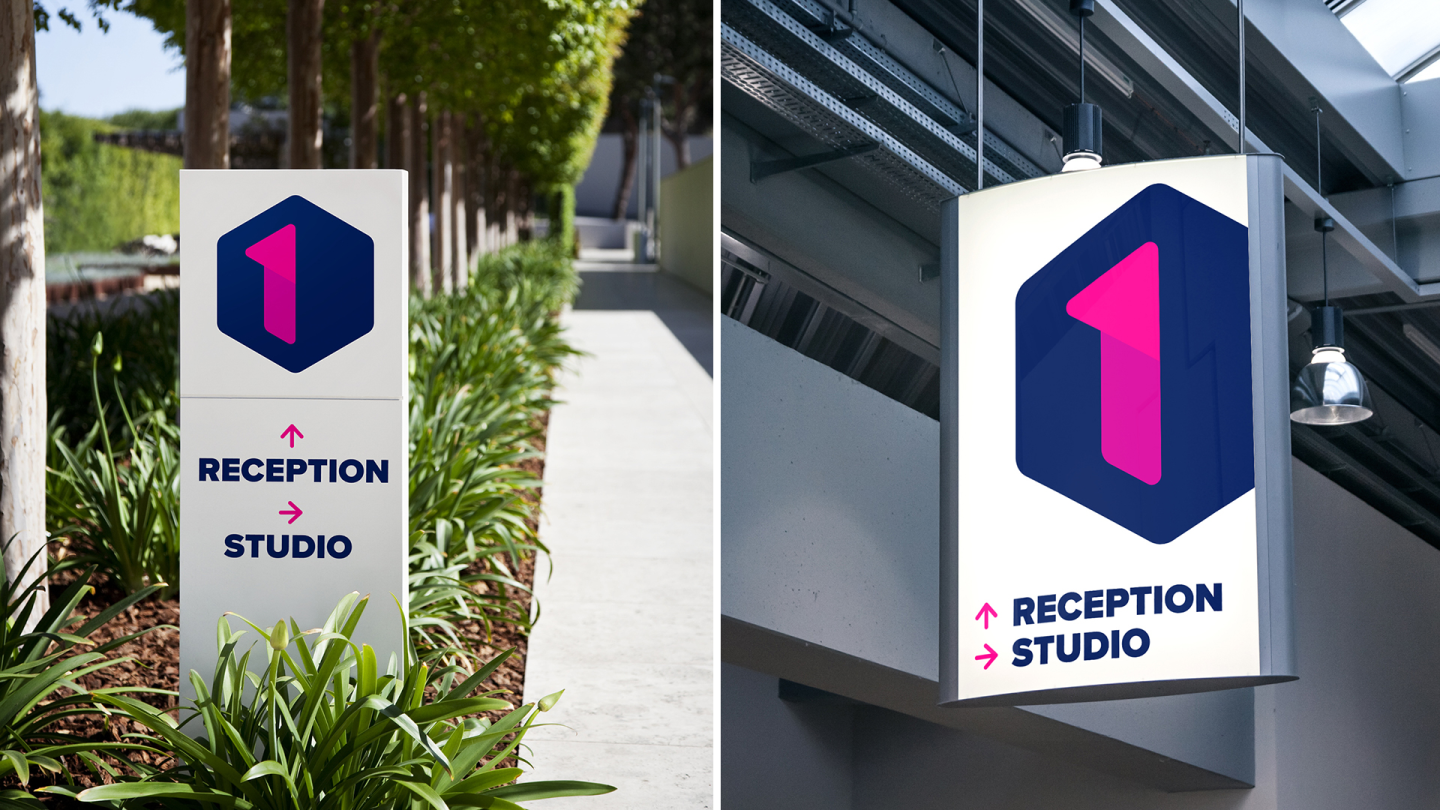
Our comprehensive process explored all relevant opportunities before arriving at the solution to revert the channel name back to the numeral 1 and away from the written word form of the previous logo. This shift reinforced the channel’s legacy and amplified the international scope of the channel’s expanded output, particularly in premium drama production.
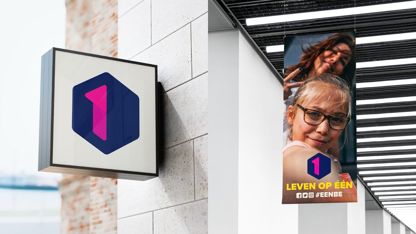
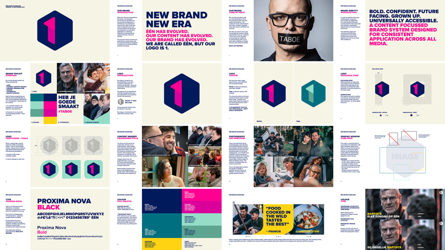
Our logo design purposefully represents key values and objectives of the brand, being bold, confident, future-embracing, friendly, dynamic, digital and universally accessible.
Visual Identity Toolkit
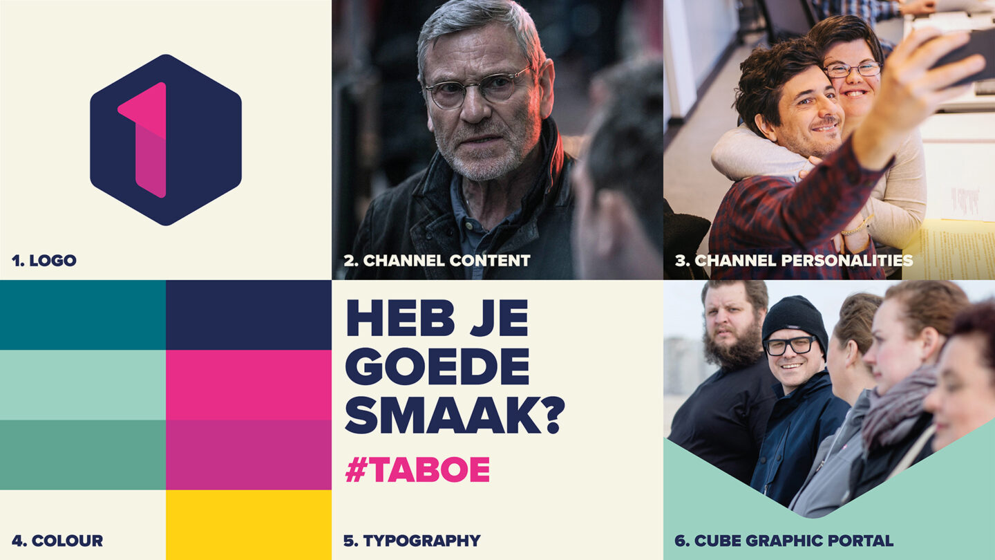
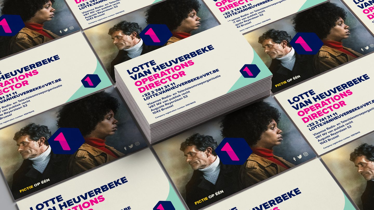
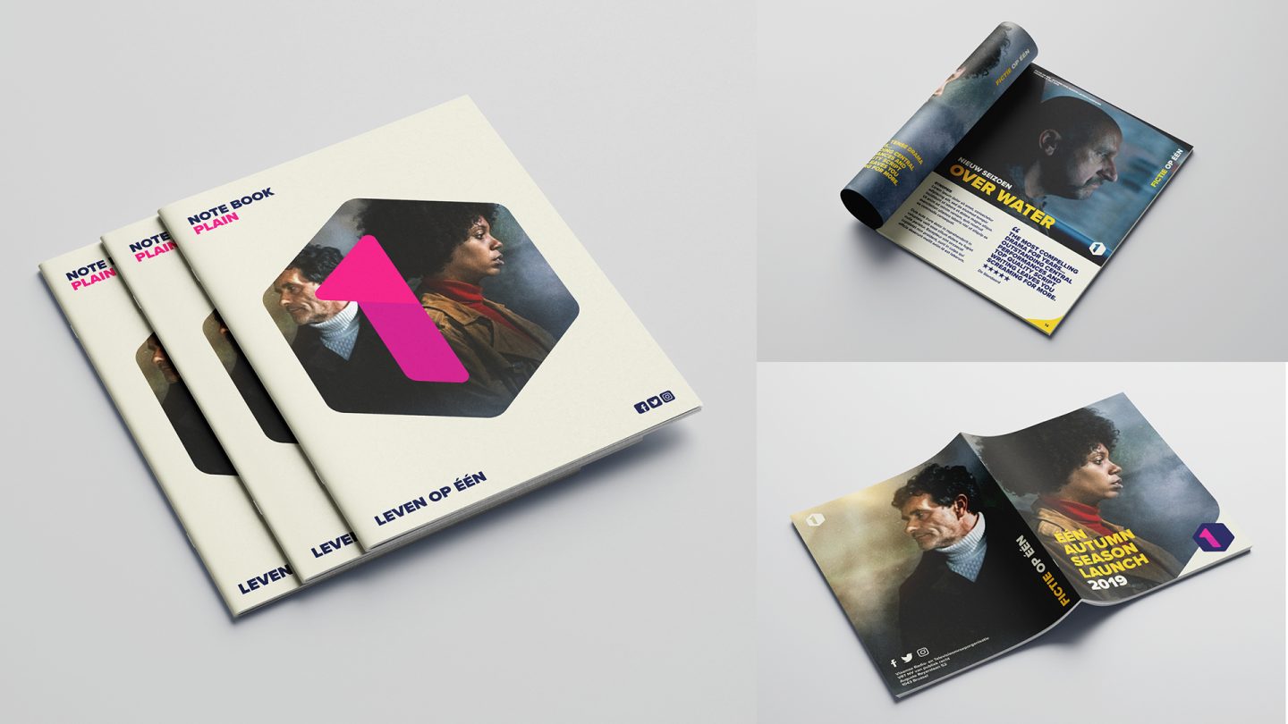
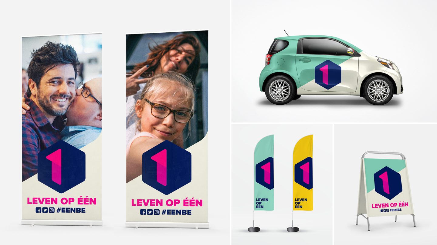
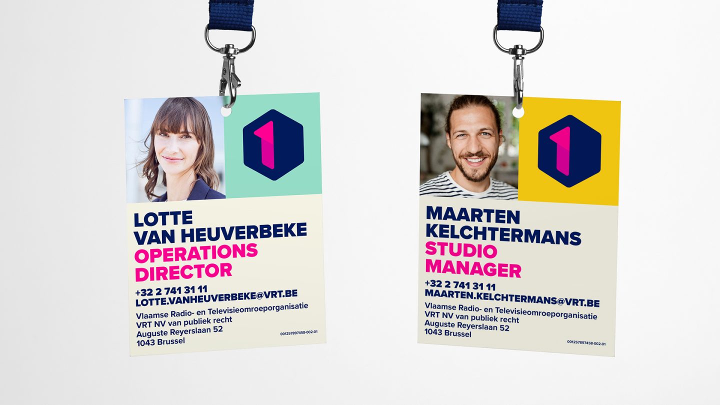
For ease of application and to maximise brand continuity across all communications we created a toolkit of key components.
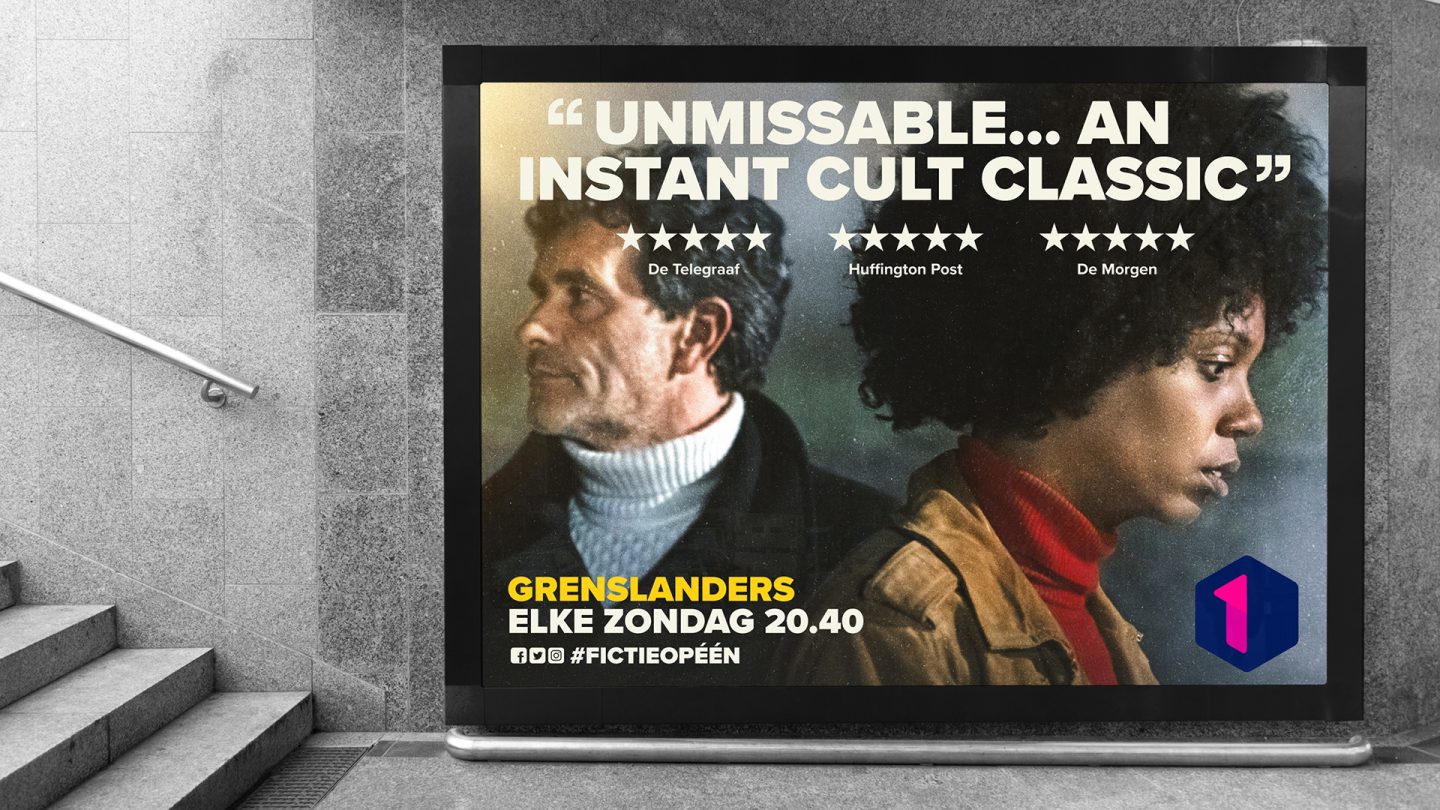
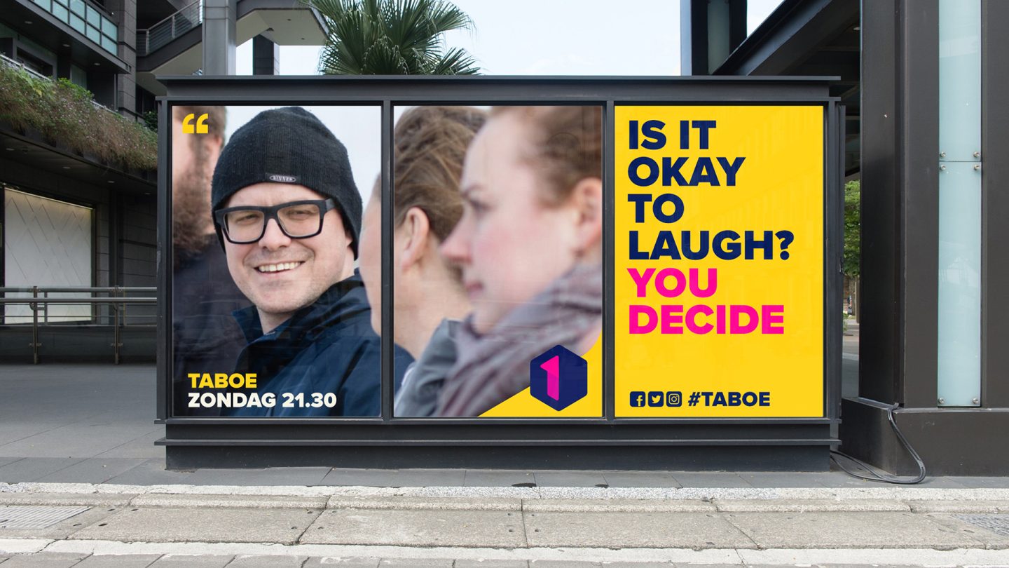
Each of these components are distinct to the brand identity, so they can be applied individually or in combination – depending on the context: in a clearly branded context, less elements are required, an external advertising context will require more to ensure brand recognition.

Content is King
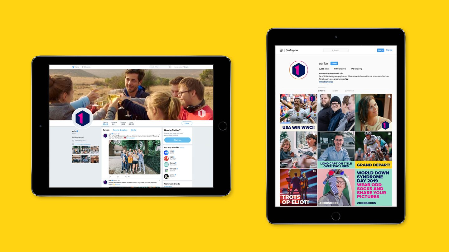
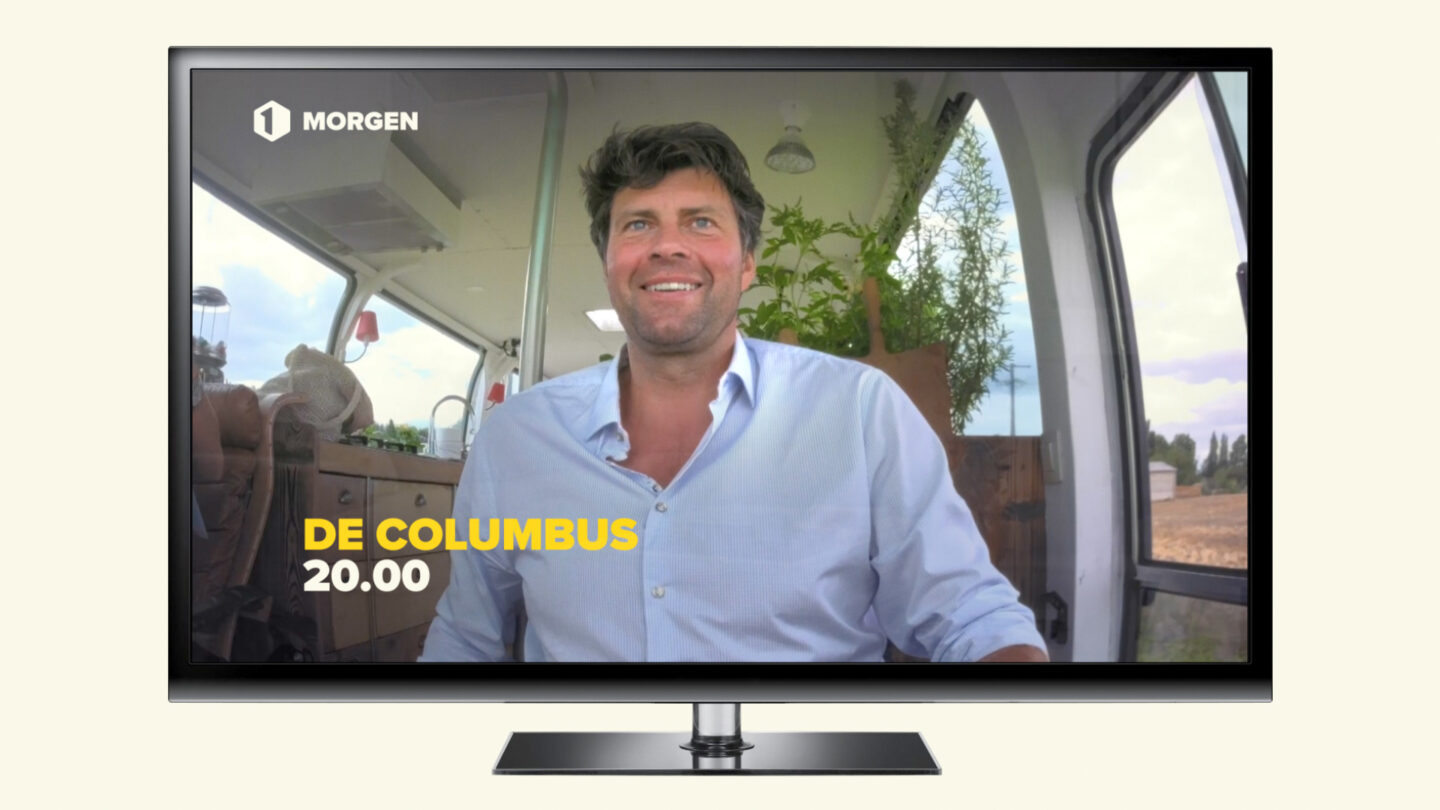
Designing a flexible graphic kit that allows for all communication needs and translates to all platforms – from broadcast television to digital media.
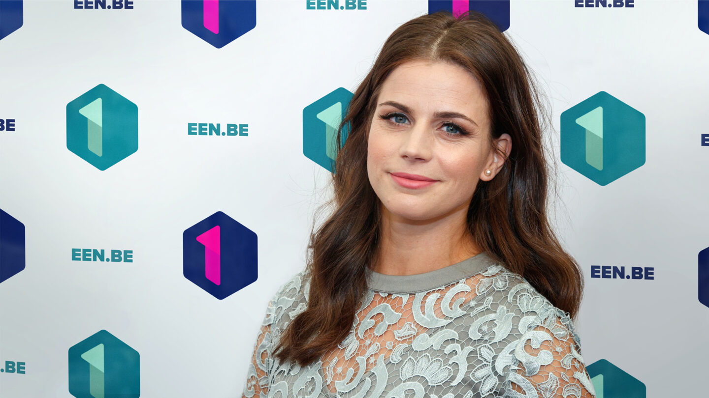
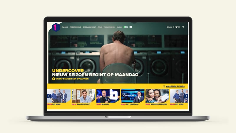
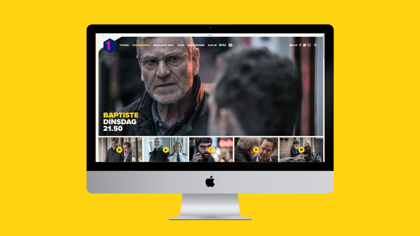
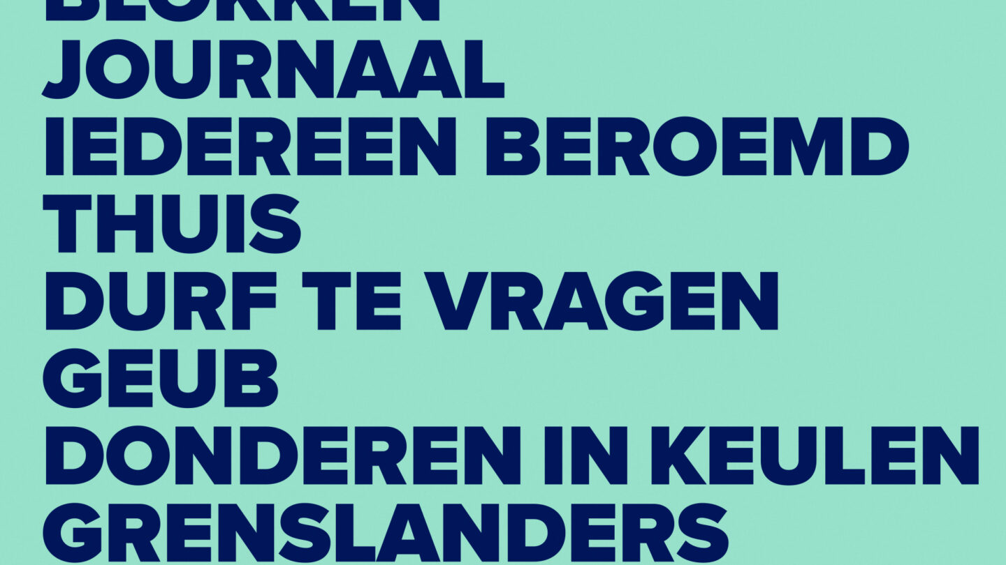
The logo cube graphic was used as a portal to content, multiplying to create a sense of abundant shows, with numerous updatable templates allowing for endless variation for promos, idents and menu packages. This light touch branding for use in a channel context gives prominence to the content but feels distinctly owned by the channel.
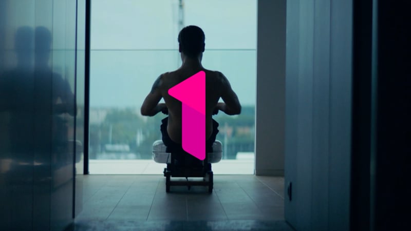
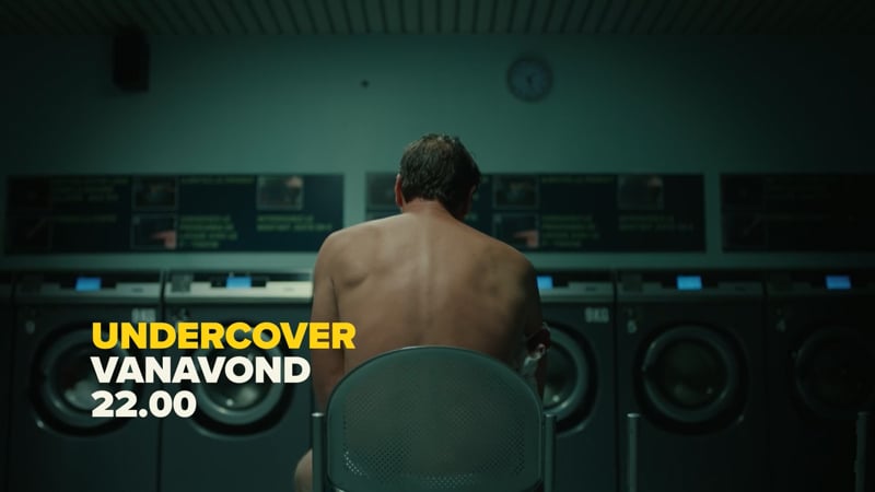
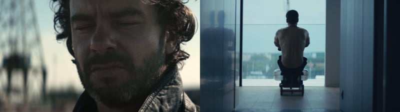
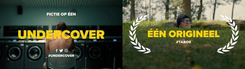
Game shows, talk shows, cooking shows, documentaries, current affairs, comedy, news and powerful drama series – the identity needed to accommodate the complete spectrum without compromise.
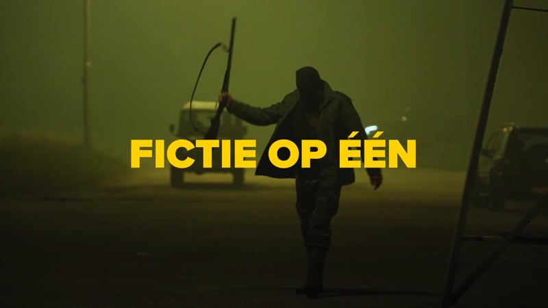
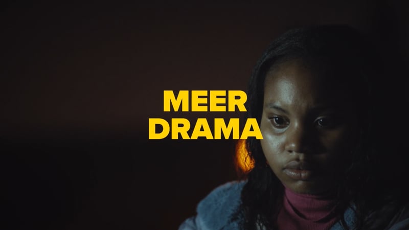
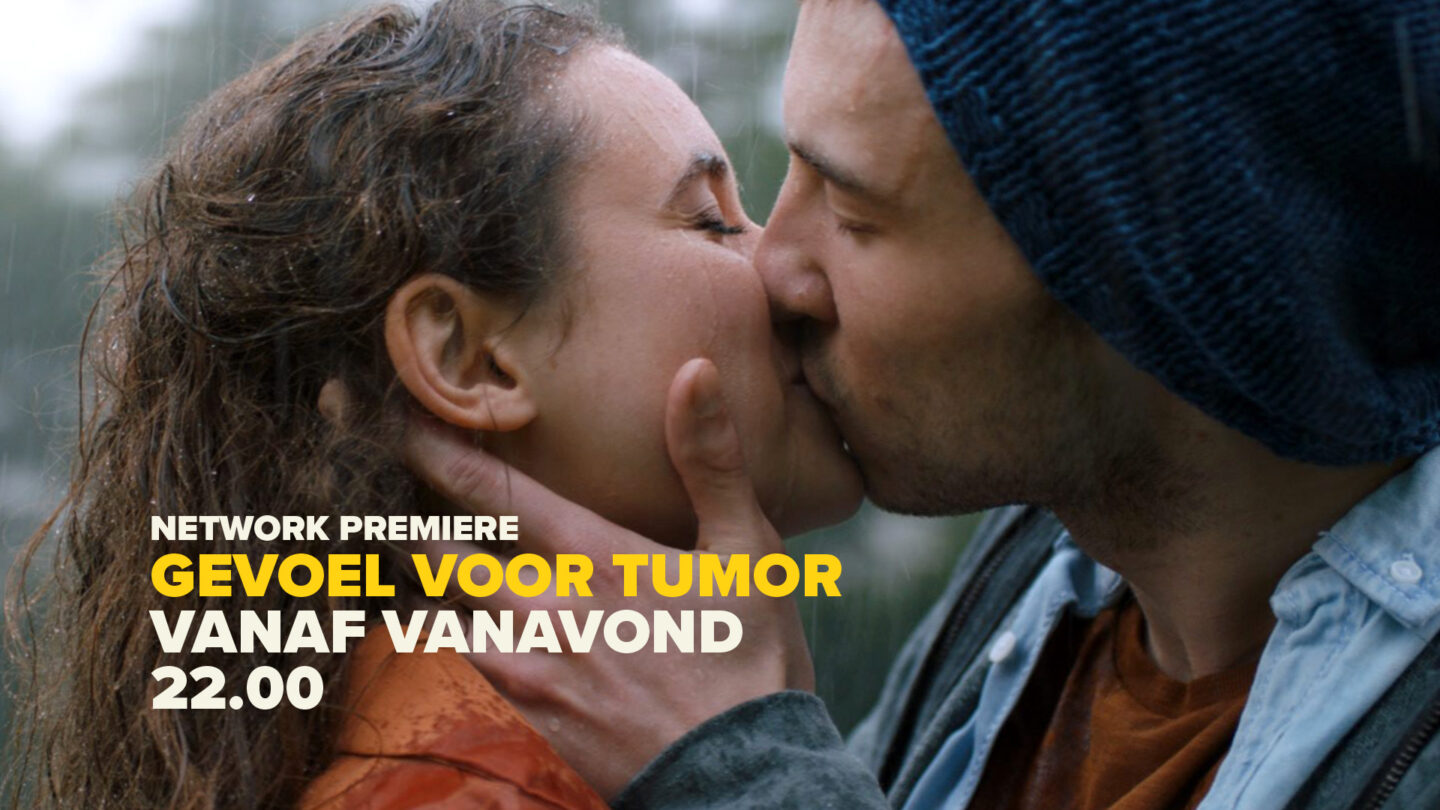
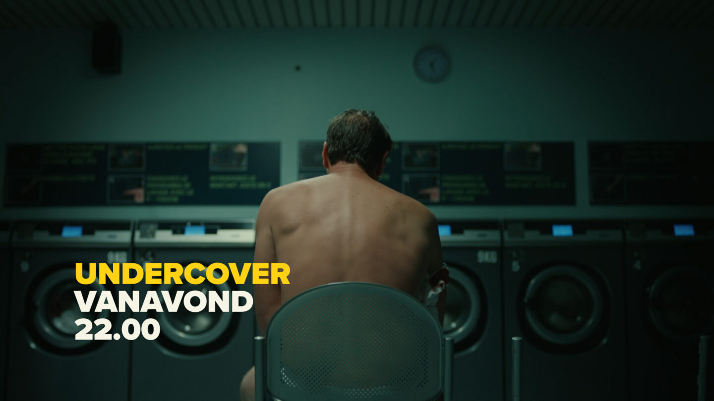
A key consideration during the design phase was the emergence of the channel’s premium drama production output, so all developments could be tested in this context. We produced a number of promos using the toolkit to announce new seasons of original premium drama.
Guidelines & Templates
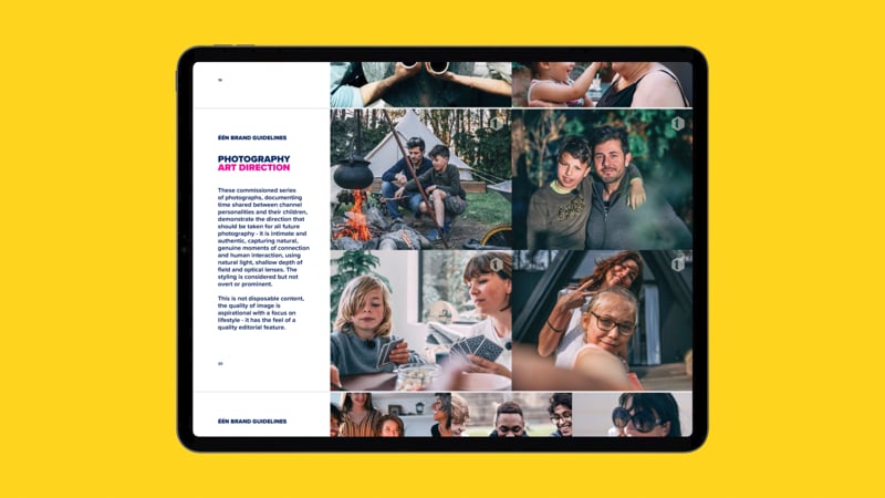
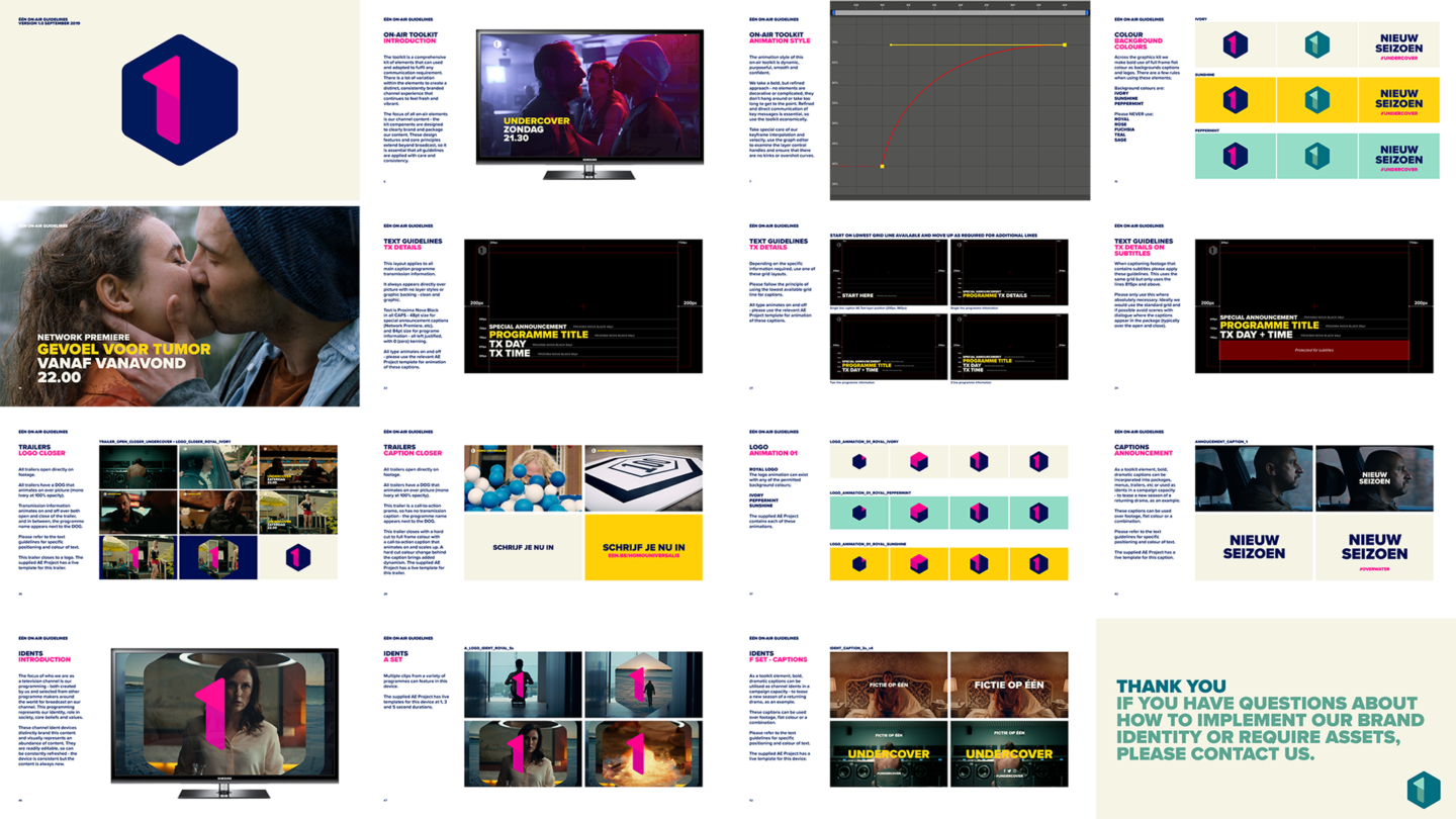
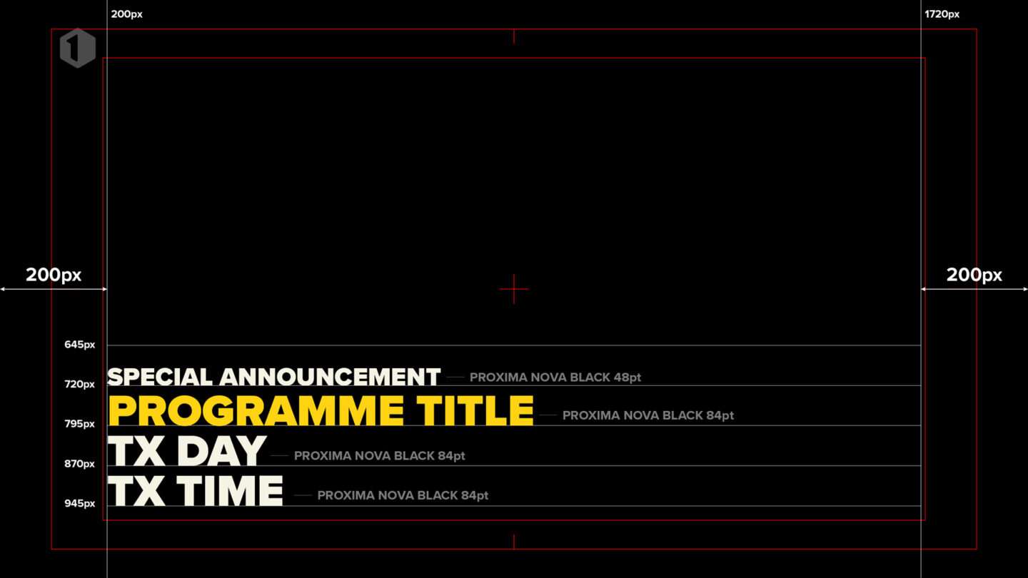
Broadcast television channels have significant communication requirements, all of which will need to be assembled and delivered by numerous agencies, both internal and external, so detailed guidelines and easily accessible templates were required. We worked closely with all departments responsible for the technical delivery of broadcast elements to ensure consistency and quality of application.
Individual digital guideline documents were created to cover the key areas of brand representation – moving image and static, including print, digital and OOH.
A Brand for all Seasons
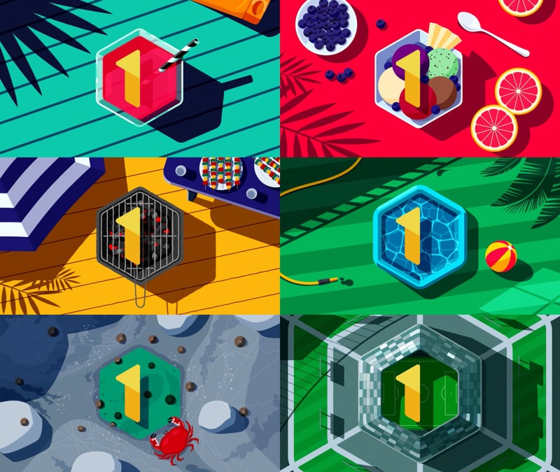
Creating a series of seasonal idents throughout the year that fulfil all the requirements and expectations of the channel and build on the brand experience.
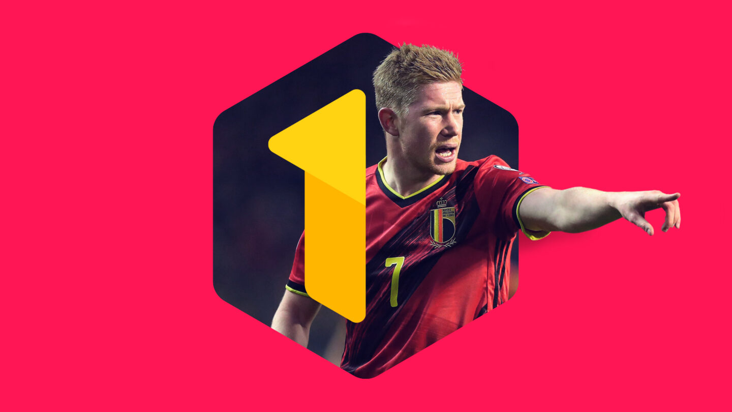
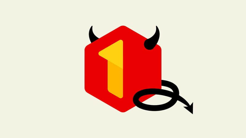
Further customisation of the identity toolkit and temporary colour changes took place during major events such as the Olympic Games and the Euros, where the identity could align with campaign content.